The Importance of Drawing, Play & Colour
Oct 05, 2026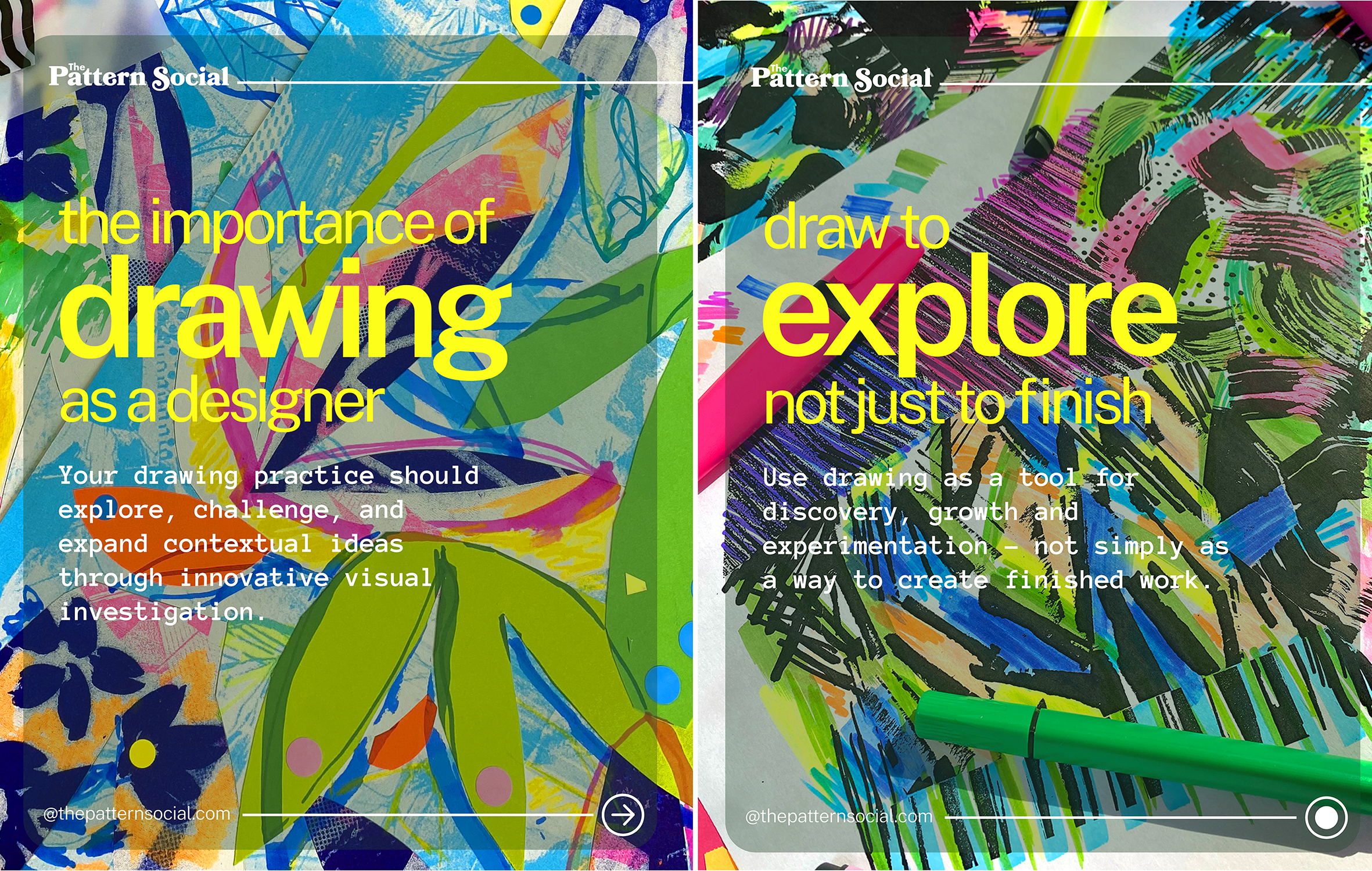 A reflection on my teaching practice, the artists who continually inspire me, and why the best surface pattern designs begin long before the finished repeat.
I stood in front of a room full of brand new first-year textile design students and delivered their very first university brief. It’s one of my favourite moments in the academic year. The room is full of excitement, nerves and endless possibility.
And every year, without fail, the same questions arrive within minutes.
“What exactly do you want us to produce?” “How many pieces should we make?” “What media should we use?”
They’re good questions. Thoughtful questions. But they also reveal something about how many of us have learned to approach creativity: we’re often searching for the right answer before we’ve given ourselves permission to explore.
My response is always the same.
At this stage, I’m not interested in polished outcomes. I’m interested in playful beginnings.
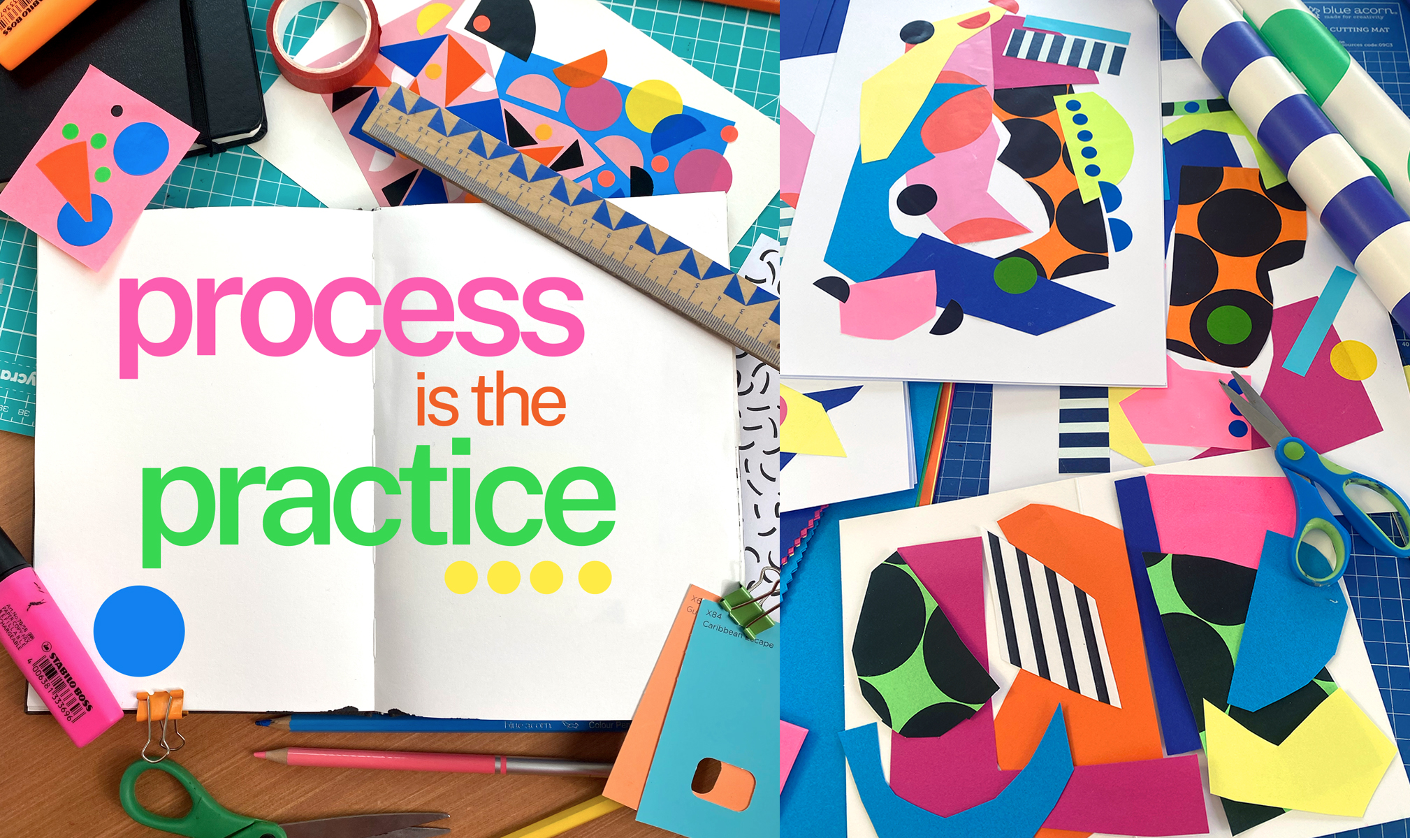
That conversation became the inspiration for our recent The Importance of Play carousel, and it sits beautifully alongside our previous manifesto on The Importance of Drawing. Together, they express something that has shaped my own teaching for over twenty years:
Process is not the route to the outcome. Process is the practice.
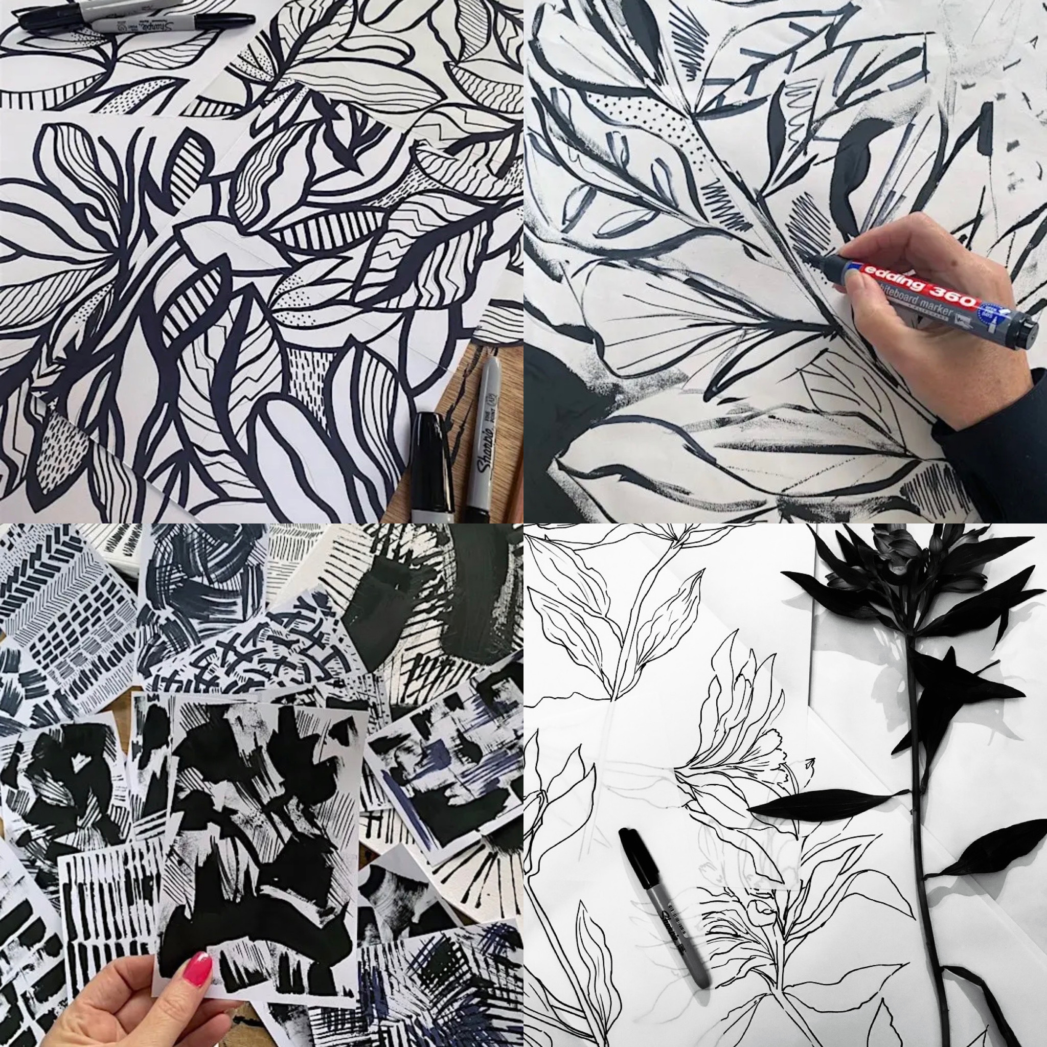
Drawing is a way of noticing
One of the biggest misconceptions I encounter is that drawing is about being able to draw well. I couldn’t disagree more.
Drawing is one of the most powerful thinking tools we have. It slows us down enough to notice shape, rhythm, proportion and movement. It allows us to investigate an object rather than simply record it. A loose sketch often contains more personality than a perfectly rendered illustration because it captures how we were looking.
I often tell my students that their sketchbook isn’t a portfolio - it’s a conversation with themselves.
Some pages will be beautiful. Many won’t. That’s exactly as it should be.
The marks that feel unresolved today often become the starting point for tomorrow’s collection.
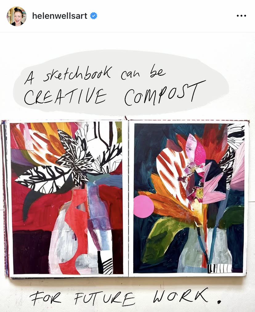
Love this quote below by Helen Wells about Creative Compost - brilliant! Check out her instagram - it is jammed packed with creativity tips!
Play is where ideas become possible
The word play is sometimes dismissed as something childish or unstructured. I see it very differently.
Play is a creative methodology.
It’s the moment we stop asking, “Is this good?” and start asking, “What happens if…?”
What happens if I crop this drawing?
What happens if I repeat this shape fifty times?
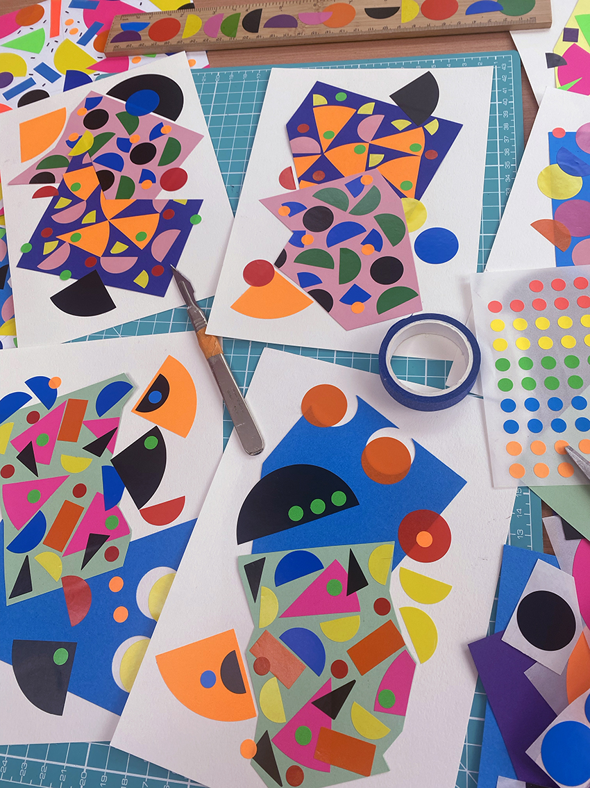
What happens if I combine gouache with stickers and found paper?
Those questions are infinitely more valuable than trying to make something perfect on the first attempt.
I think that’s why so many people connected with our carousel. It wasn’t really about play, it was about giving ourselves permission to be curious again.
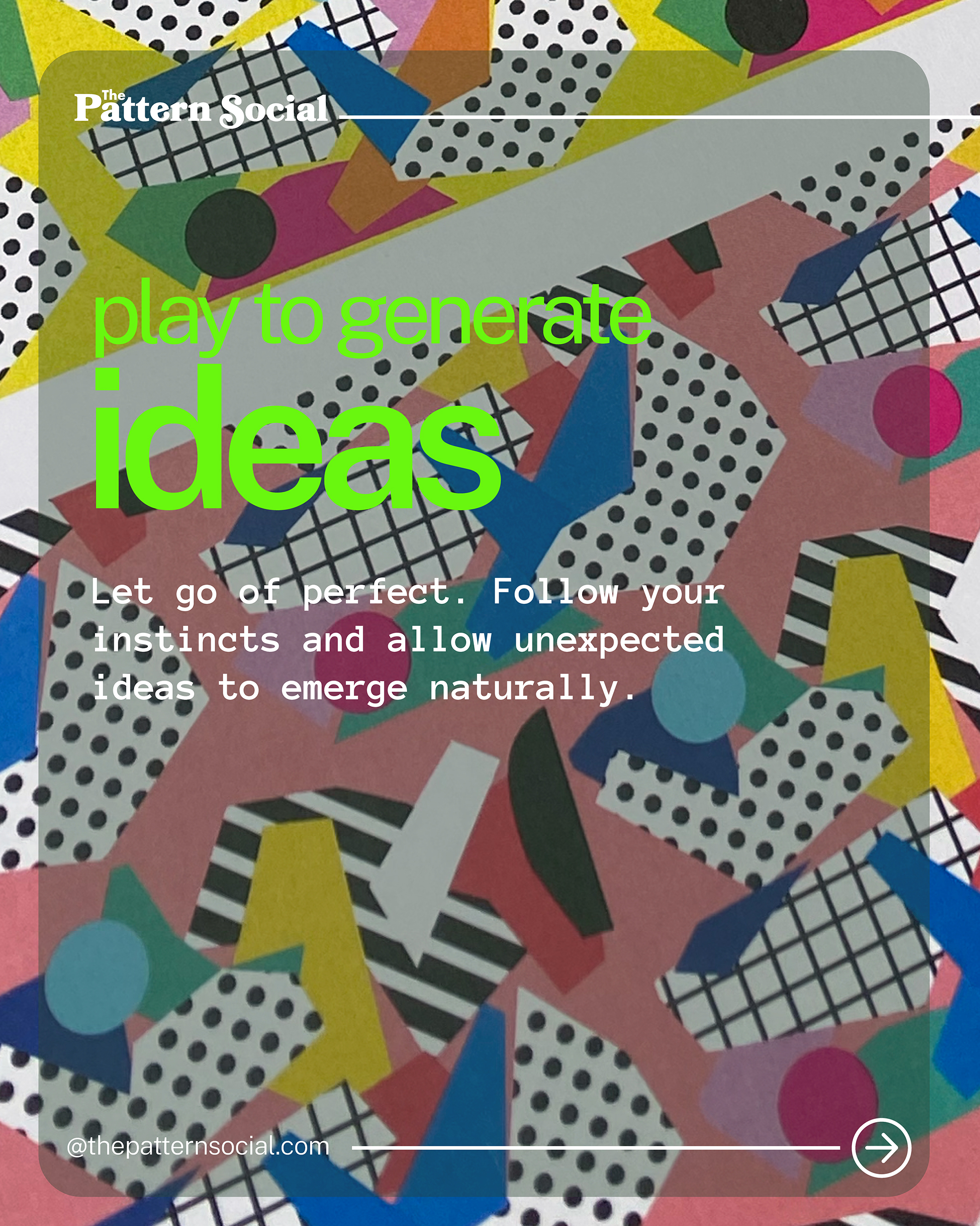
Here are a few photographs from a Play Workshop I led with the Graphic Design team at Hallmark’s head office - a team that included my husband Mark.
The brief was wonderfully simple: put the computers away and play with analogue drawing and making. Using paper, paint, collage, stickers and found materials, the focus wasn’t on designing a finished card or creating polished artwork. It was about exploring ideas through curiosity.
Interestingly, it was often the most experienced designers who found the workshop the most challenging. After years of working to briefs, deadlines and client expectations, being given permission to simply play felt surprisingly unfamiliar. Stepping outside our comfort zones isn’t always easy but it’s often where the most original ideas begin.
Looking back, this workshop perfectly captures the philosophy behind The Importance of Drawing, Play & Colour: creativity flourishes when we allow ourselves to experiment before we strive for perfection.
Artists who remind me how joyful making can be
Every designer has people they return to again and again. These are some of mine.
Eloisa Henderson-Figueroa - the joy of creative play
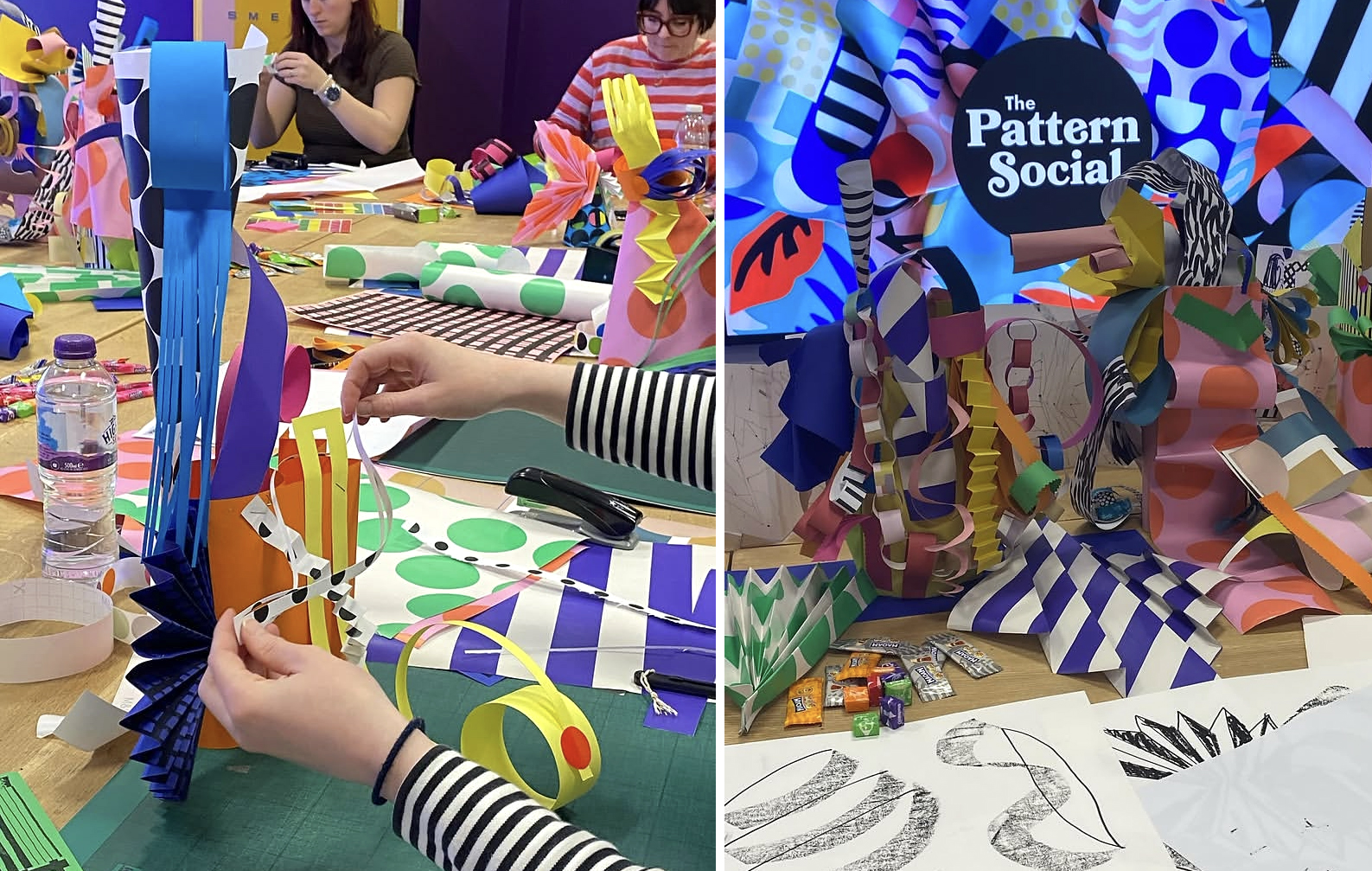
London-based artist Eloisa Henderson-Figueroa creates work that makes me smile every single time I see it.
Her practice feels wonderfully unashamed of colour. Bold painted shapes, collage, stickers, hand-cut forms and playful compositions all come together with an incredible sense of freedom. There’s nothing overworked about it; instead, it feels spontaneous whilst being deeply considered.
I love that we share a fascination with collage and stickers - not as decorative additions, but as genuine creative tools. They invite accident, layering and unexpected relationships, which is often where the strongest visual ideas emerge. These playful sticker ideas are very much the springboard for her finished outcomes for her larger scale digital pieces and murals.
Her work is a beautiful reminder that joy is a serious creative pursuit (although she does seem to be having a lot of fun!) Check more of Eloisa's wonderful work here
Sarah Campbell - celebrating the hand
For anyone interested in textile design, Sarah Campbell is nothing short of a national treasure.
Her hand-painted patterns have an effortless confidence that I find endlessly inspiring. They celebrate irregularity rather than trying to eliminate it. You can almost see the brush travelling across the paper, and that human quality gives the work warmth and authenticity.
In an increasingly digital world, Sarah’s work reminds me that the hand still has an extraordinary voice. Pop onto her colourful website to see the plethora of pattern she has created over the decades!
Coco Lom - finding joy in the everyday
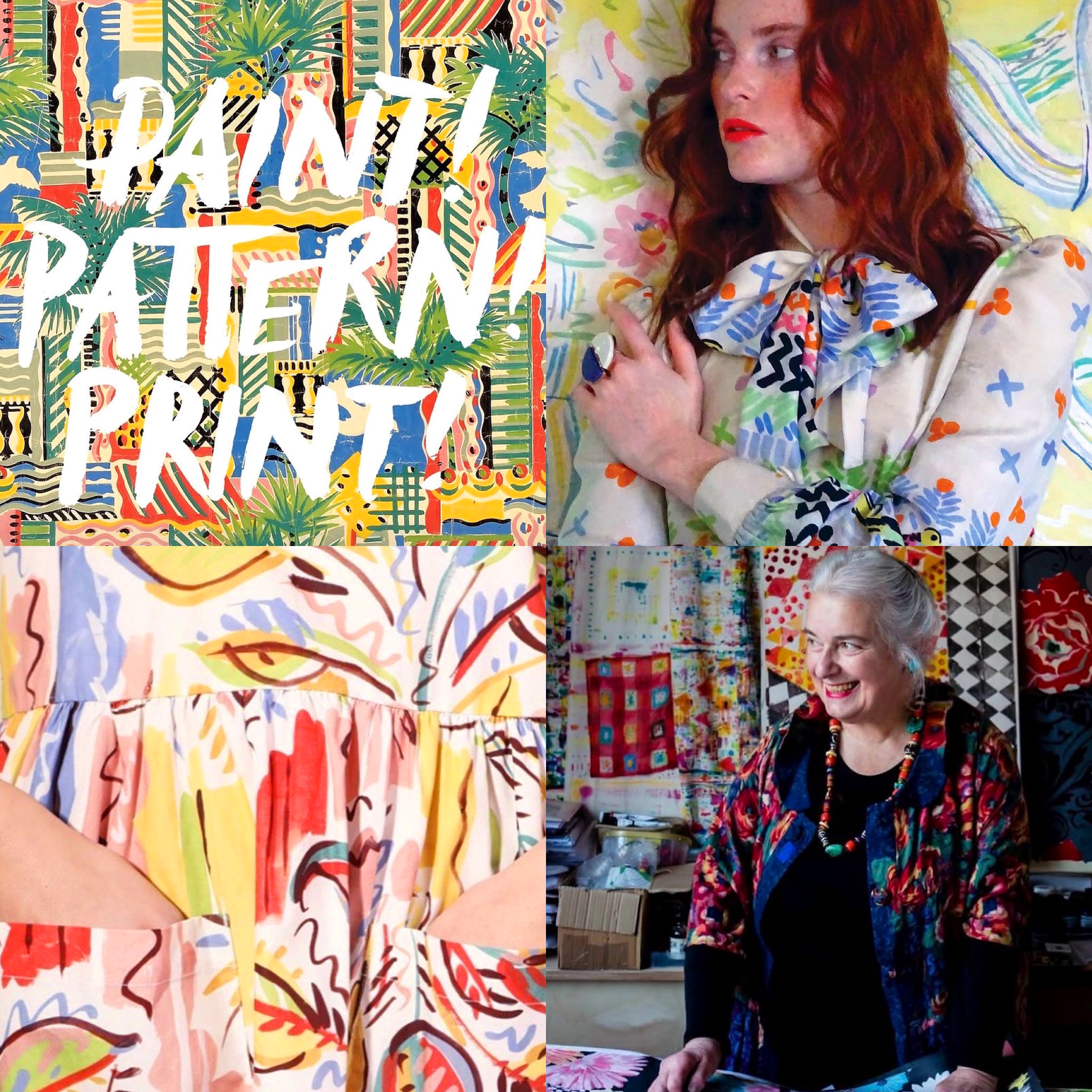
Another artist whose work really inspires me is Coco Lom, a multidisciplinary artist and designer based in East London. Coco describes herself as a “pattern seeker, colour lover, shadow chaser and stripe enthusiast” and I think that says so much about her approach to creativity.
What I particularly love about Coco’s work is her ability to find inspiration in the ordinary things around us. Photography is often the starting point for her work, capturing overlooked shapes, patterns, colours and textures, which she then transforms through design, print and collage.
There is such a strong sense of play and curiosity running through her practice. Her workshops encourage people to look differently at the world around them and to explore shapes, patterns and colour without being overly concerned with the outcome.
I particularly connect with her love of collage, bold colour and pattern. Her work feels joyful and energetic, but it also starts with something very simple: looking. Noticing a shadow on a wall, an interesting arrangement of objects, a stripe, a shape or an unexpected colour combination.
That feels very connected to the way I encourage my own students to work. Inspiration doesn't always need to come from a beautiful flower, an exotic location or a carefully curated Pinterest board. Sometimes it's right in front of us if we slow down enough to notice it.
Coco's work is a wonderful reminder that drawing, photography, collage and colour can all be ways of looking at the world, and that curiosity can turn those everyday observations into something completely new.
And perhaps most importantly, her work has a real sense of joy. It doesn't take itself too seriously. It makes you want to look, make, experiment and play. Check out her instagram account for a burst of maximalism!
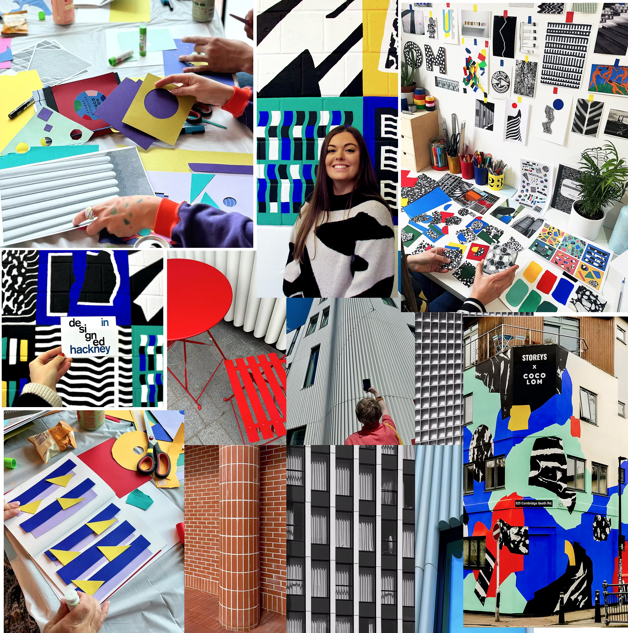
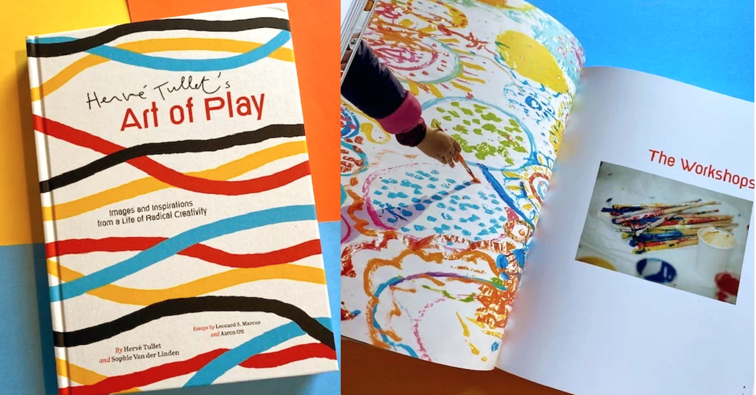
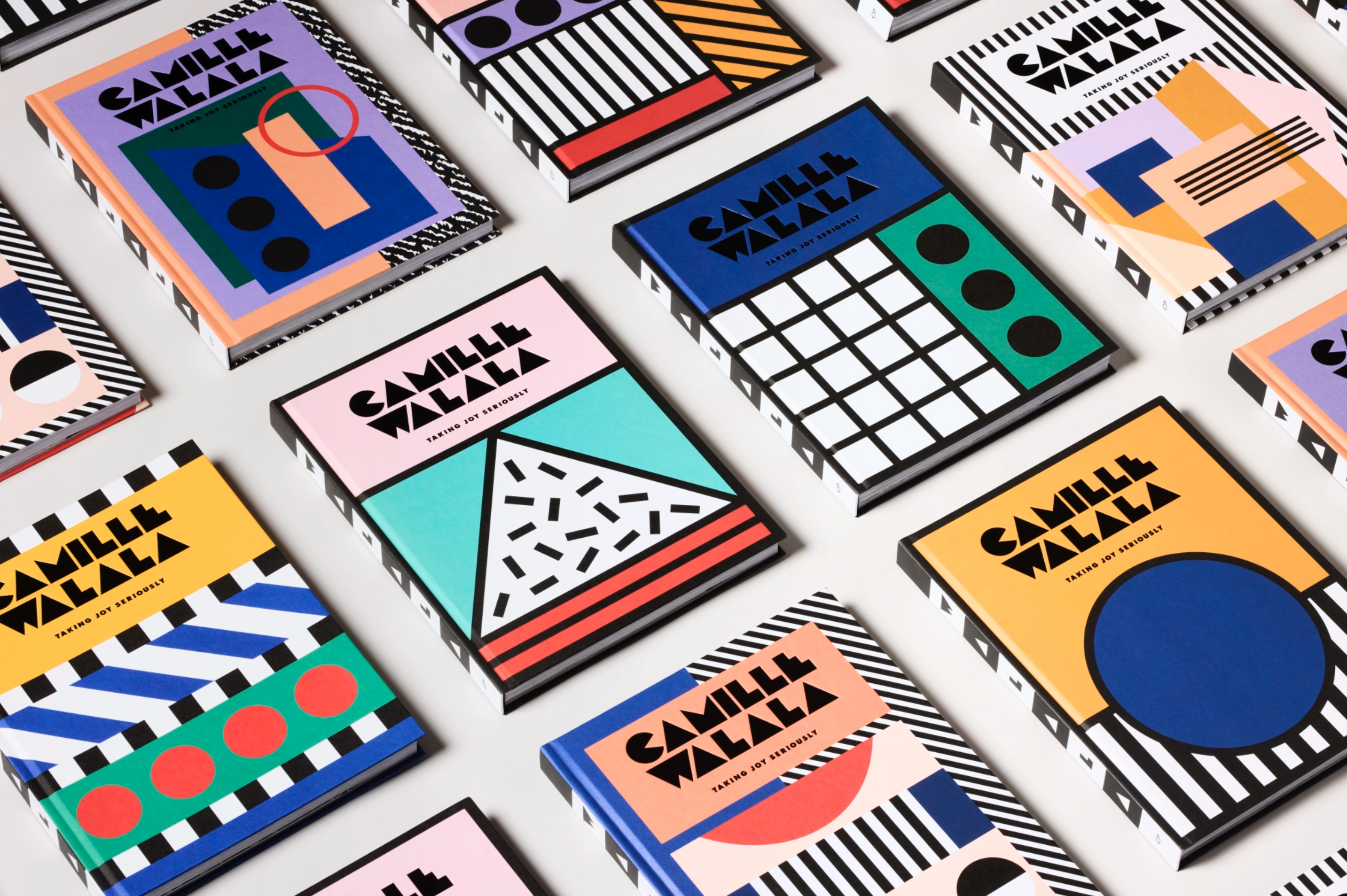
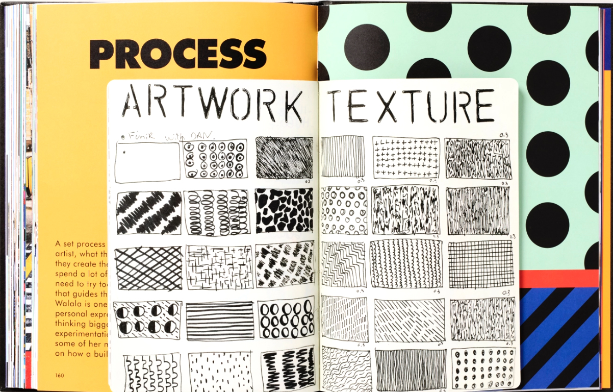
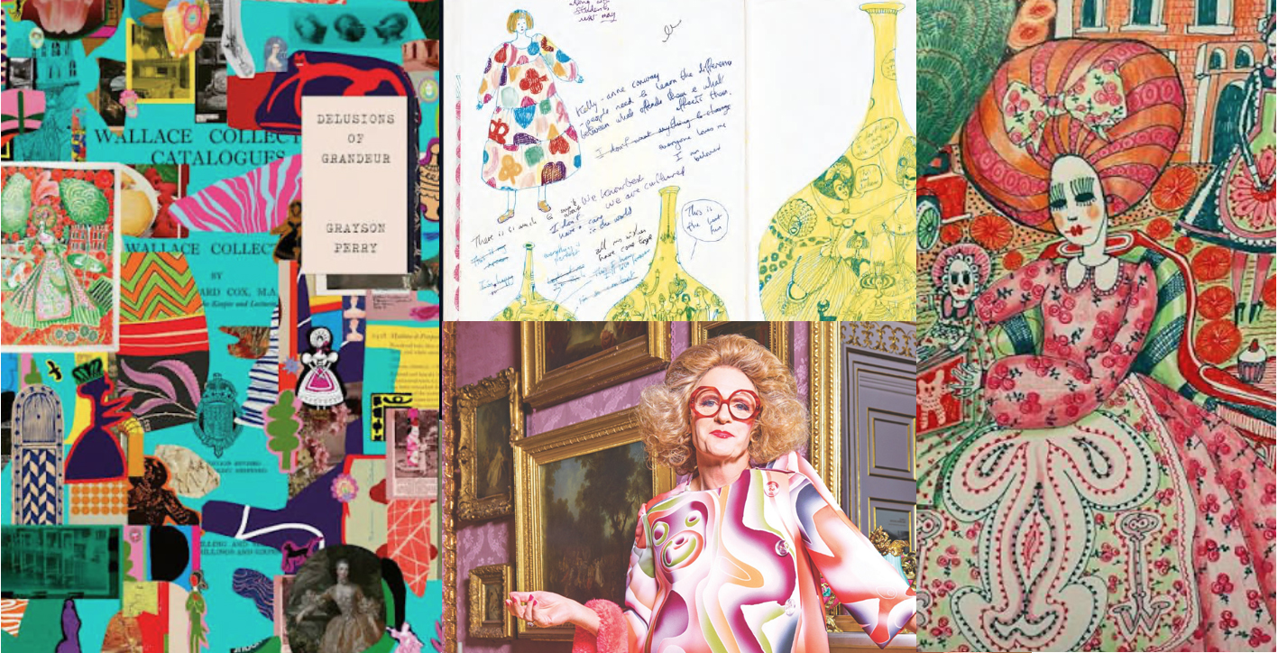
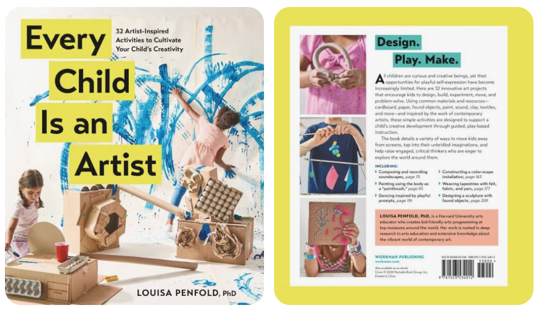
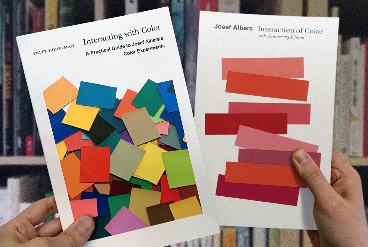
Four books that have shaped my creative practice
Finally - what I hope my students remember
If my students forget the technical demonstrations from their first week, I honestly don’t mind.
What I hope stays with them is this:
-
Draw to observe, not to impress.
-
Play to generate ideas, not just to have fun.
-
Explore colour before trying to perfect a palette.
-
Let curiosity lead before outcomes take over.
Creative confidence isn’t built through one brilliant project. It’s built through hundreds of small experiments, happy accidents and playful decisions that gradually become your own visual language.
That philosophy is at the heart of everything we do at The Pattern Social, and it’s exactly why we created Join the Dots and The One Motif Course.
An invitation to our Join the Dotters
If you’ve recently joined Join the Dots, I’d love you to share your playful work in the community.
Not your most polished pattern. Not the finished collection.
Share the page of unexpected marks. The colourful collage made from stickers. The colour swatches that surprised you. The unfinished idea that feels full of possibility.
Because those playful beginnings are often far more interesting than the finished outcome.
Let’s celebrate process over perfection - together.