The Importance of Colour in Design
Nov 02, 2026This blog post was inspired by a lecture on colour that I recently delivered to undergraduate design students. Preparing the lecture gave me the opportunity to revisit some of the principles, artists and designers that have shaped my own understanding of colour, as well as reflect on its importance within the creative process. I wanted to share some of these ideas more widely, encouraging designers to look at colour with fresh eyes, experiment beyond their usual palettes and develop a more personal approach to using colour in their work.
Finding Your Own Colour Language
Colour is one of the most powerful tools a designer has. It can transform a simple shape into something striking, create a particular mood, draw the eye and give a design its own distinctive identity. In surface pattern design, where shapes and motifs may be relatively simple, it is often the colour palette that brings a design to life, adding depth, character and sophistication.
But choosing colour is about much more than finding combinations that look good together. It involves understanding how colours interact, how they influence the way we experience a design, and how we can use them to communicate an idea or feeling.
For a surface pattern designer, colour deserves just as much time and attention as drawing, motif development and composition. It is not simply the finishing touch; it is an essential part of the creative process.
We All See Colour Differently
Although colour is rooted in the science of light, our experience of it is far more personal. The colours we see are influenced by how light interacts with objects, how our eyes receive that information and how our brains interpret it.
Our experiences, memories and associations also influence the way we respond to colour. Two people might look at the same shade of red and imagine something quite different. One might associate it with energy and excitement, while another might connect it with warmth, nostalgia or a particular memory.
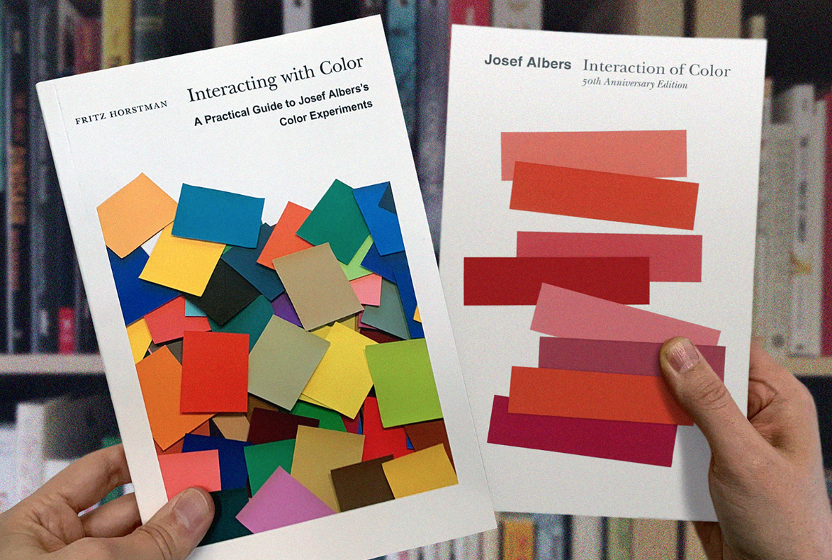
This idea is explored beautifully by artist and educator Josef Albers in his influential book Interaction of Color, first published in 1963. Albers investigated how colours change in our perception depending on the colours surrounding them. A colour that appears warm and vibrant in one setting might seem cooler, darker or more subdued when placed beside another colour.
His work reminds us that colour is never experienced in isolation. Its appearance and impact are influenced by context, placement, shape and the colours around it.
For surface pattern designers, this is particularly important. A colour that looks perfect on a swatch might behave very differently when repeated across a pattern or placed alongside other motifs. Rather than judging colours individually, we need to consider how they interact within the whole composition.
Albers's approach also encourages us to learn through looking and doing. Instead of relying entirely on theory, we can develop our understanding by experimenting with coloured papers, changing combinations and observing the results.
Explore more through Interaction of Color by Josef Albers.
Understanding Colour Relationships
Learning some basic colour theory gives us a useful starting point for making informed design decisions. Understanding complementary colours, analogous palettes, tonal contrasts and colour intensity helps us recognise why certain combinations work and how they influence a composition.
Complementary colours sit opposite one another on the colour wheel, such as blue and orange, red and green, or purple and yellow. Placed together, they can create energy, contrast and visual impact. However, when both colours are highly saturated and used in similar proportions, they can compete for attention rather than work harmoniously. Image credits @designare on Instagram - fabulous colour inspiration.
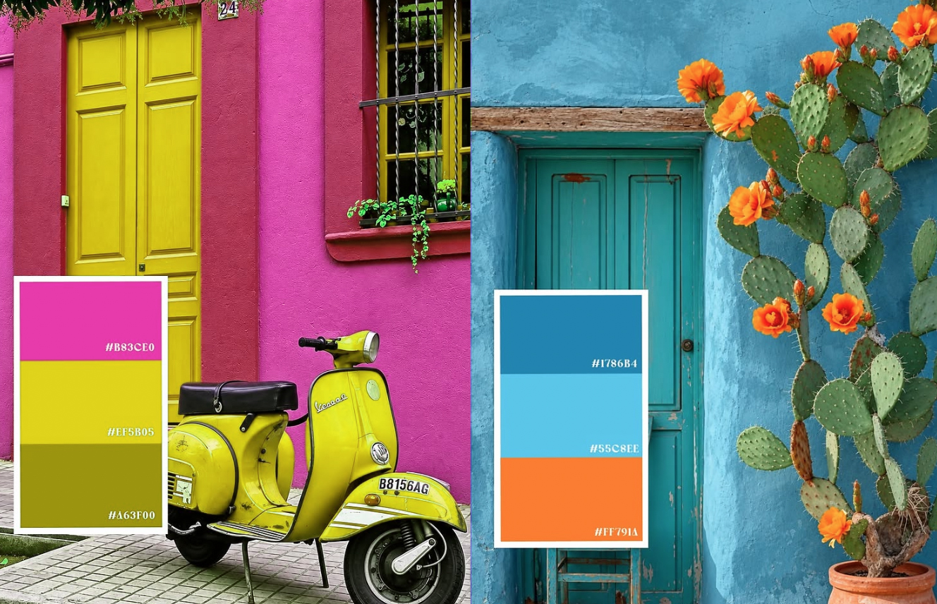
Analogous colours sit next to one another on the colour wheel and often create a more harmonious, connected palette. They can produce a quieter, more cohesive effect, although introducing contrast through tone, saturation or a small accent colour can prevent a design from feeling predictable.
We can also explore the relationship between saturated and muted colours. Bright, intense colours can create movement and excitement, while softer, more subdued palettes can feel understated, subtle or atmospheric. Combining these approaches can add complexity and balance to a design.
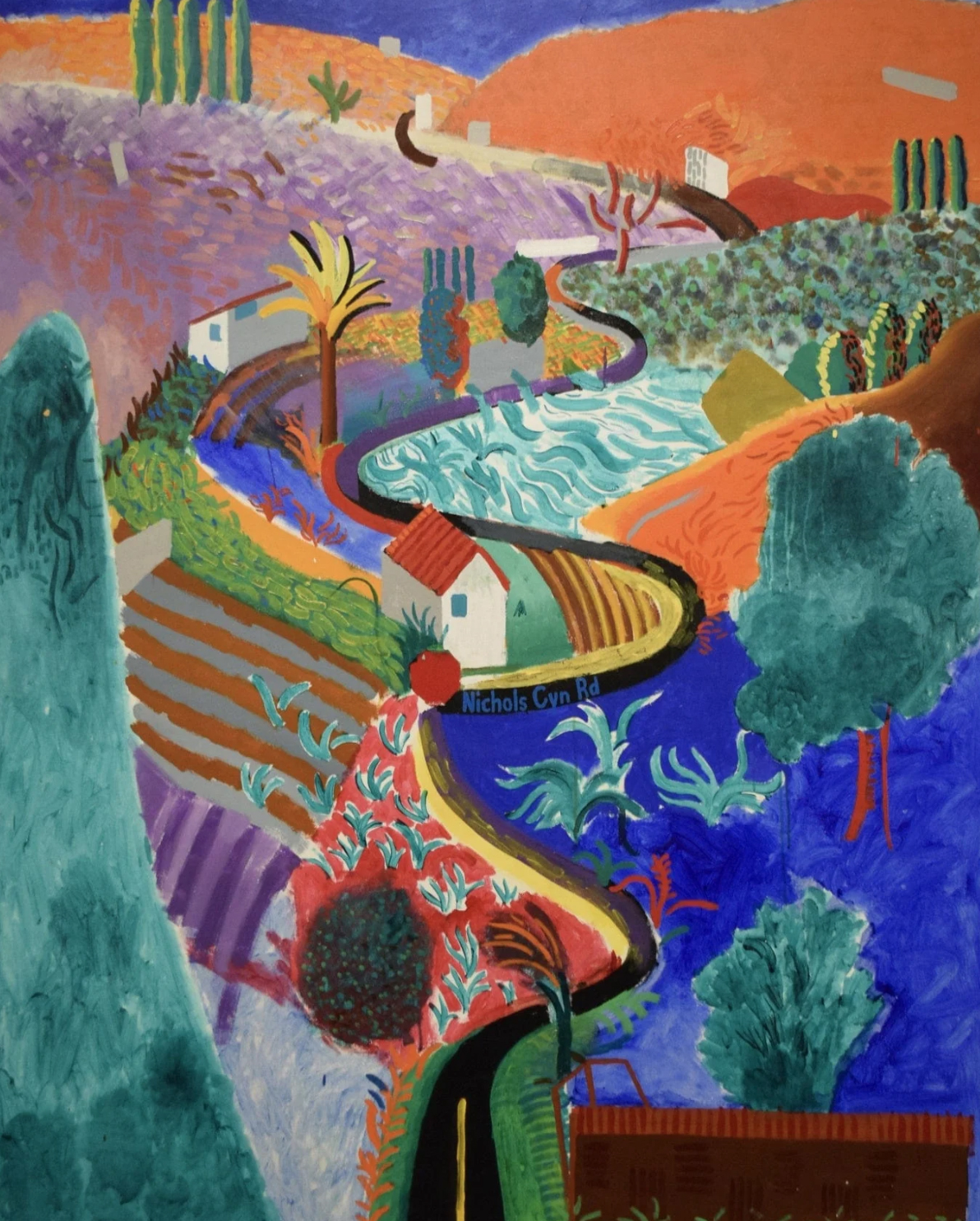
Look at the paintings of David Hockney, for example, and notice how his bold, highly saturated colours create energy and visual impact.
Compare this with the quieter, more muted palettes of Ben Nicholson, (below) whose restrained use of colour creates a very different atmosphere.
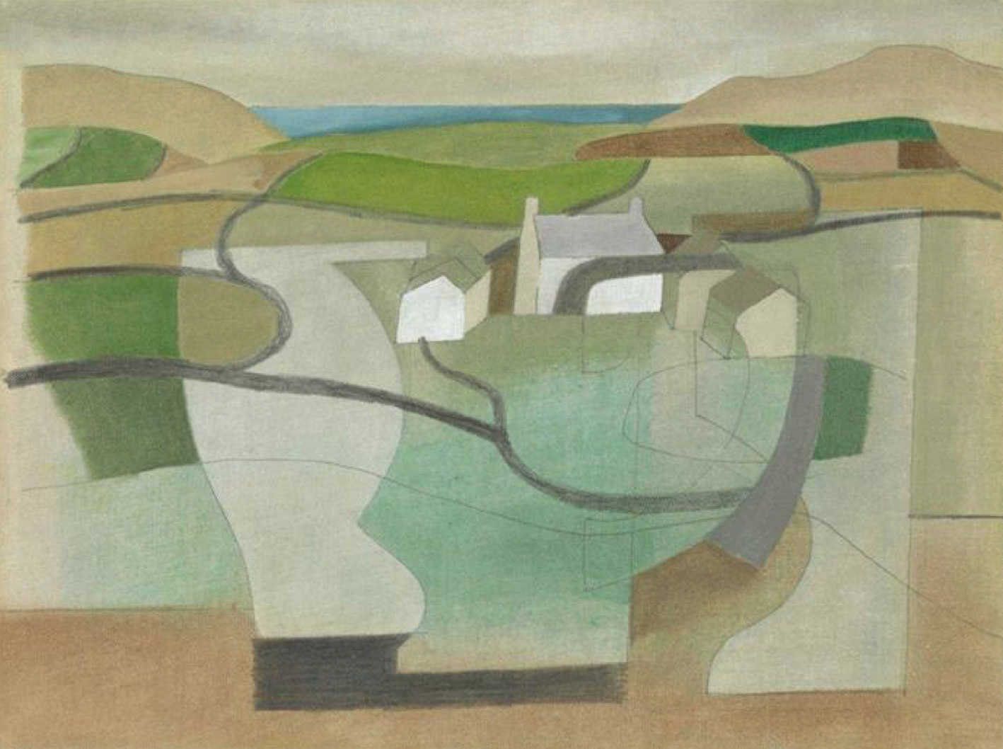
Neither approach is inherently better than the other. The important question is how colour supports the idea behind the work.
These principles are valuable tools, but they should never become restrictions. Colour theory helps us understand what is happening in a composition; experimentation helps us discover what is possible.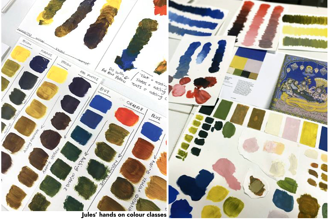
Looking at Artists and Designers for Colour Inspiration
One of the best ways to develop your understanding of colour is to look closely at how other artists and designers use it. Rather than simply collecting images that appeal to you, spend time analysing the decisions behind them.
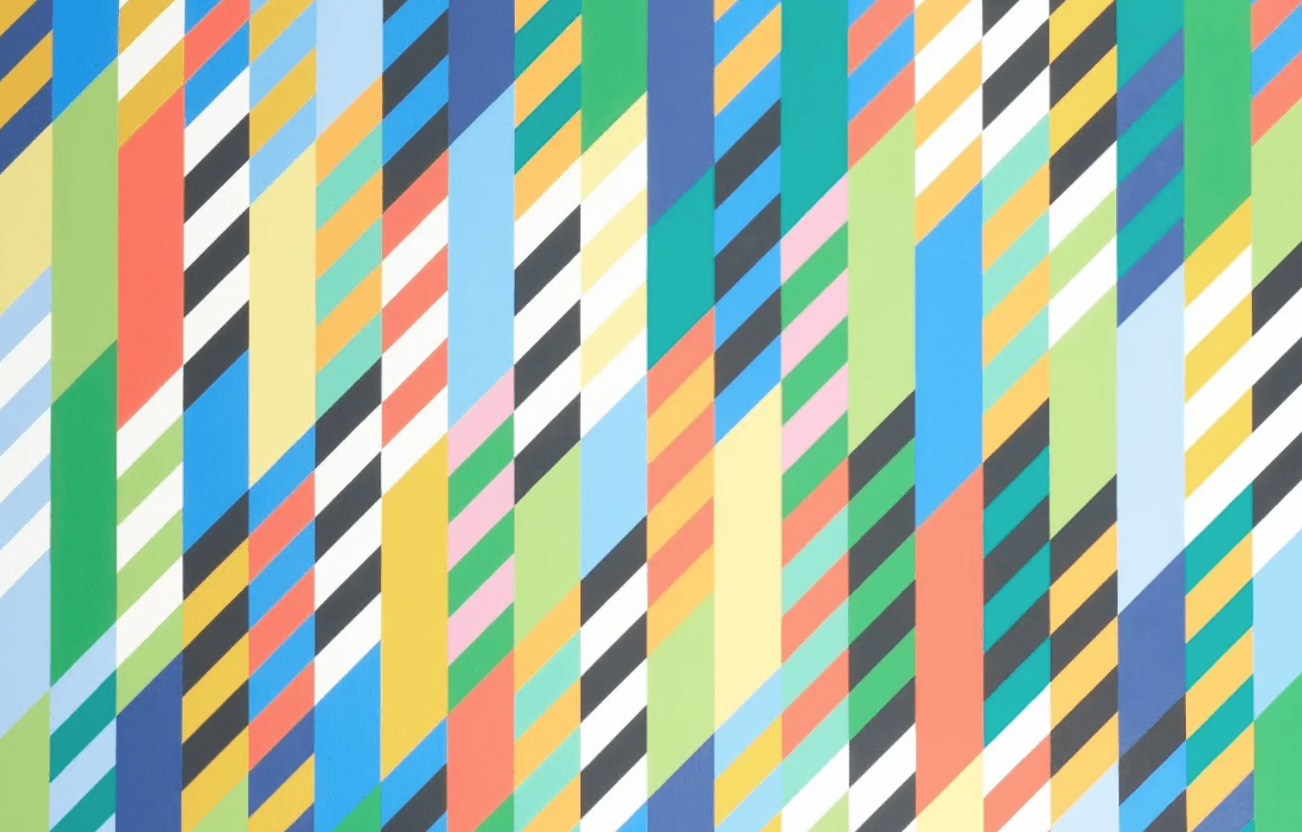
Bridget Riley is an excellent reference for exploring the relationship between colour, pattern and movement. Her carefully structured compositions demonstrate how the interaction of colours, repetition and geometry can create a powerful sense of rhythm and optical movement.
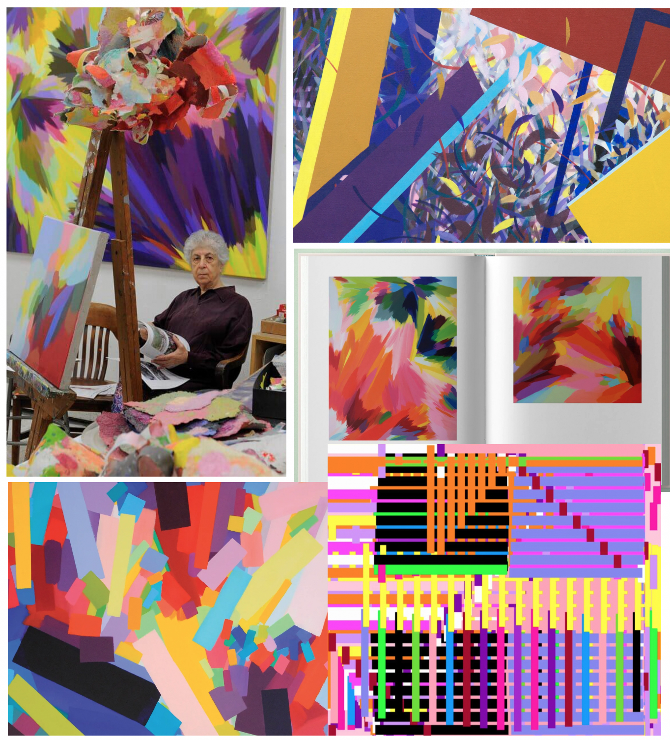
Samia Halaby, known for her abstract paintings, offers another fascinating approach. Her energetic combinations of colour demonstrate how saturated hues can be balanced with lighter, darker and more muted tones to create complexity and movement. Her book 'Samia Halaby: Five Decades of Painting and Innovation' offers an unprecedented look at one of the world's leading abstract painters. It is my all time favourite artist book. Highly recommend!
For a different perspective, look at Orla Kiely, whose distinctive surface patterns demonstrate how carefully considered palettes can become an integral part of a recognisable design identity. Her combinations of colour, simplified botanical motifs and repetition show how a relatively limited range of shapes can be transformed through thoughtful colour choices.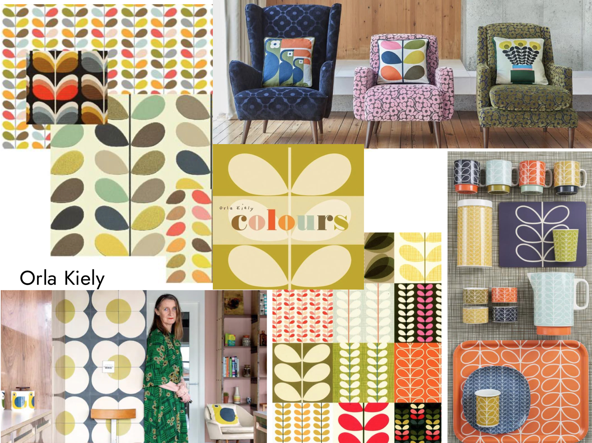
Textile and surface designer Margo Selby is also worth exploring. Her bold woven structures and carefully developed colour combinations demonstrate how colour and rhythm can work together to create richly layered designs.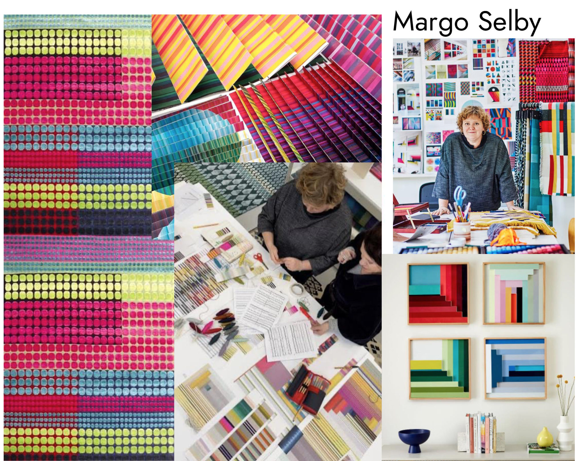
You could also investigate Jacqueline Poncelet, whose work explores the relationship between colour, pattern, architecture and the built environment. Her permanent artwork at Edgware Road Underground station offers an example of how colour and pattern can transform a public space.
These references provide very different approaches to colour, from bold and adventurous to subtle and carefully controlled. The aim is not to copy their palettes, but to understand how colour choices contribute to the character of their work.
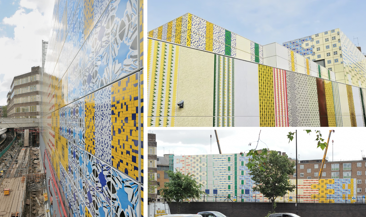
Ask yourself: What attracts me to this combination? How has the designer balanced the colours? What happens when one colour dominates? How might I apply a similar principle to my own motifs?
The Importance of Colour Proportion and Balance
Choosing a successful colour palette is only part of the process. Equally important is deciding how much of each colour to use.
A palette containing beautiful individual colours can feel completely different depending on their proportion, placement and relationship to one another. A small accent of a bright colour might create a focal point, while using that same colour across a much larger area could dominate the entire composition.
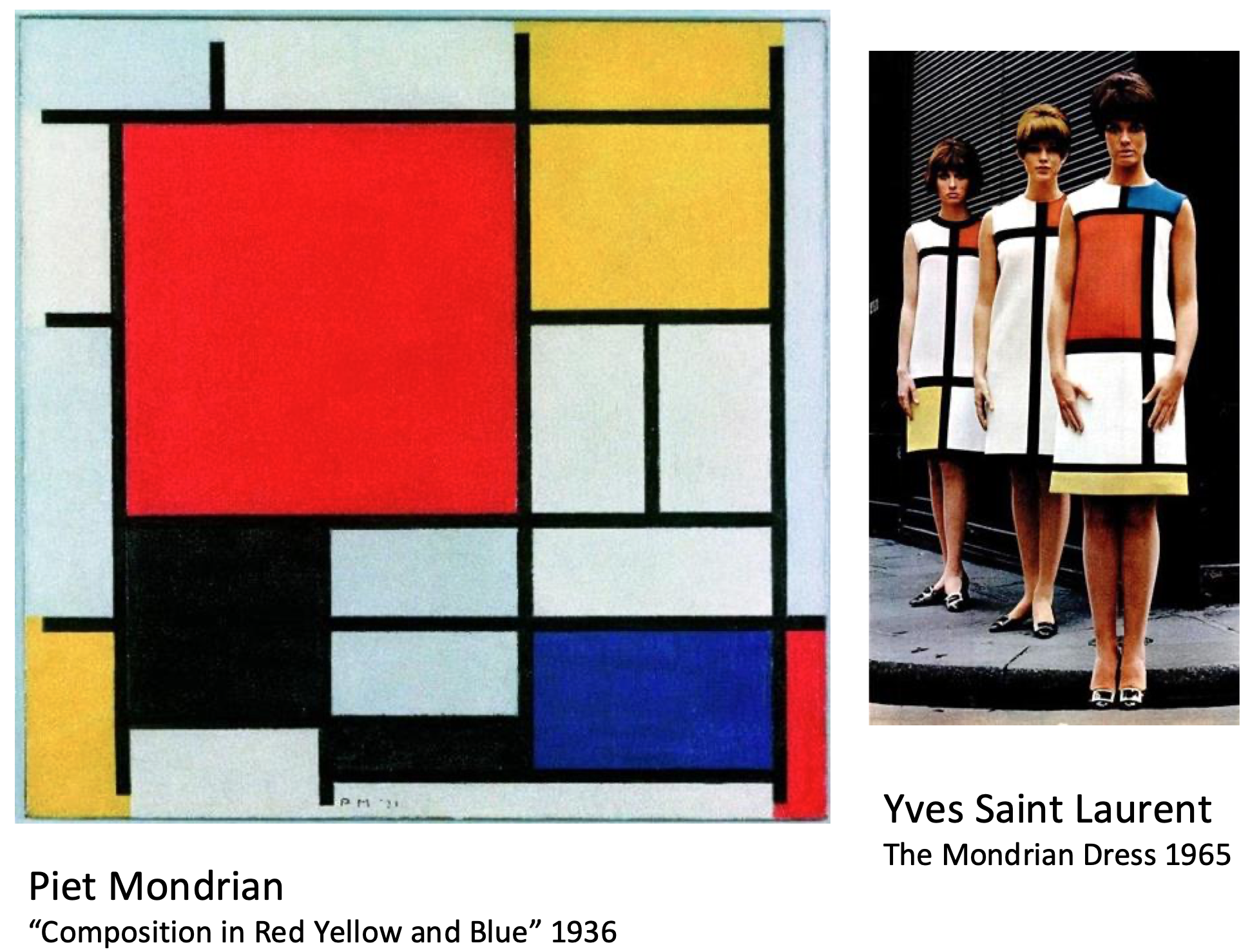
Think about the work of Piet Mondrian, whose compositions demonstrate how a limited palette of primary colours, balanced with black and white, can create a strong and distinctive visual language. The impact comes not just from the colours themselves, but from their placement, scale and proportion.
In surface pattern design, proportion becomes particularly important when a design is repeated across a larger area. A palette might contain five or six colours, but that doesn't mean each colour should appear in equal amounts.
Consider which colour will lead, which colours will support it and where a contrasting accent might create interest. Try reducing the amount of your brightest colour, introducing more neutral space or allowing a darker tone to anchor the composition.
Small adjustments can dramatically change the mood and balance of a pattern.
This is also a useful way to revisit Josef Albers's ideas. A colour's impact depends not only on its individual properties, but also on what surrounds it and how much space it occupies.
When developing a palette, think about both the colours you choose and the relationships you create between them.
Developing Your Own Colour Story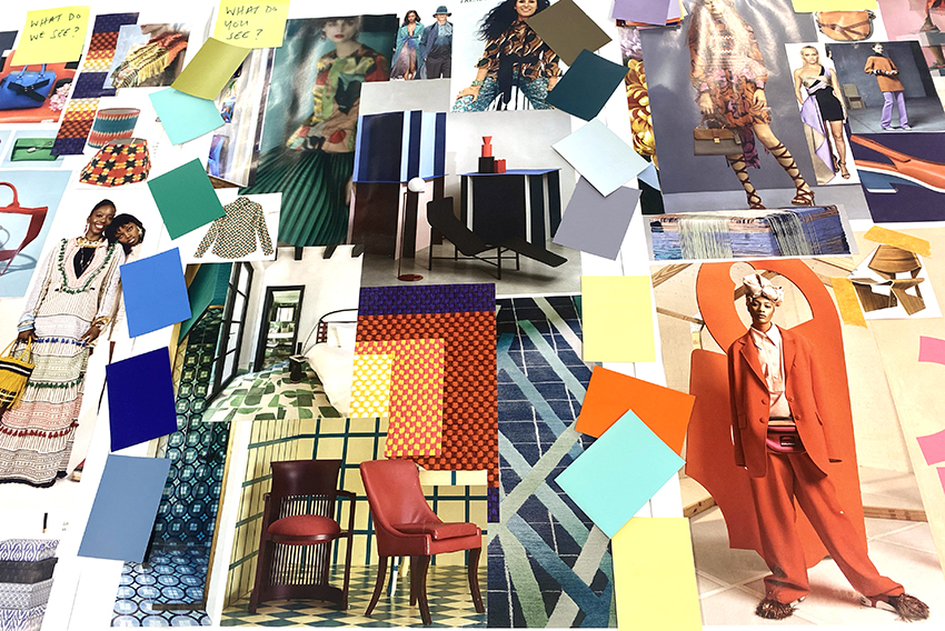
A colour story is more than a collection of colours that look attractive together. It is a carefully considered palette that communicates the mood, theme or concept behind a design project.
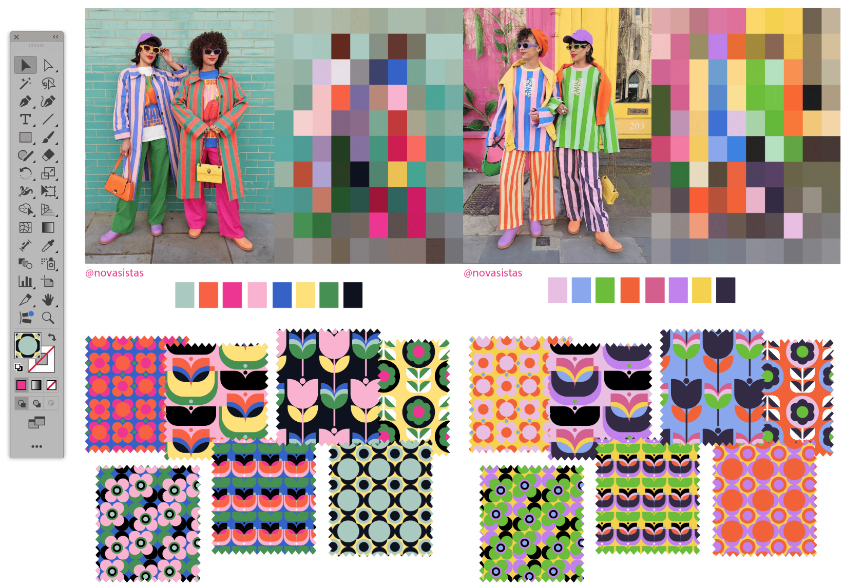
Developing one begins with research. Look closely at your source imagery, photographs, moodboards, materials and design references. What colours keep appearing? Are you drawn to a particular combination? Is there a strong contrast, a subtle tonal relationship or an unexpected accent that could become the starting point for your palette?
Colour inspiration can come from almost anywhere: architecture, landscapes, artworks, interiors, vintage objects, fashion, natural forms and everyday observations. Sometimes the most interesting palettes emerge from unexpected sources.
Once you have gathered your references, begin to experiment.
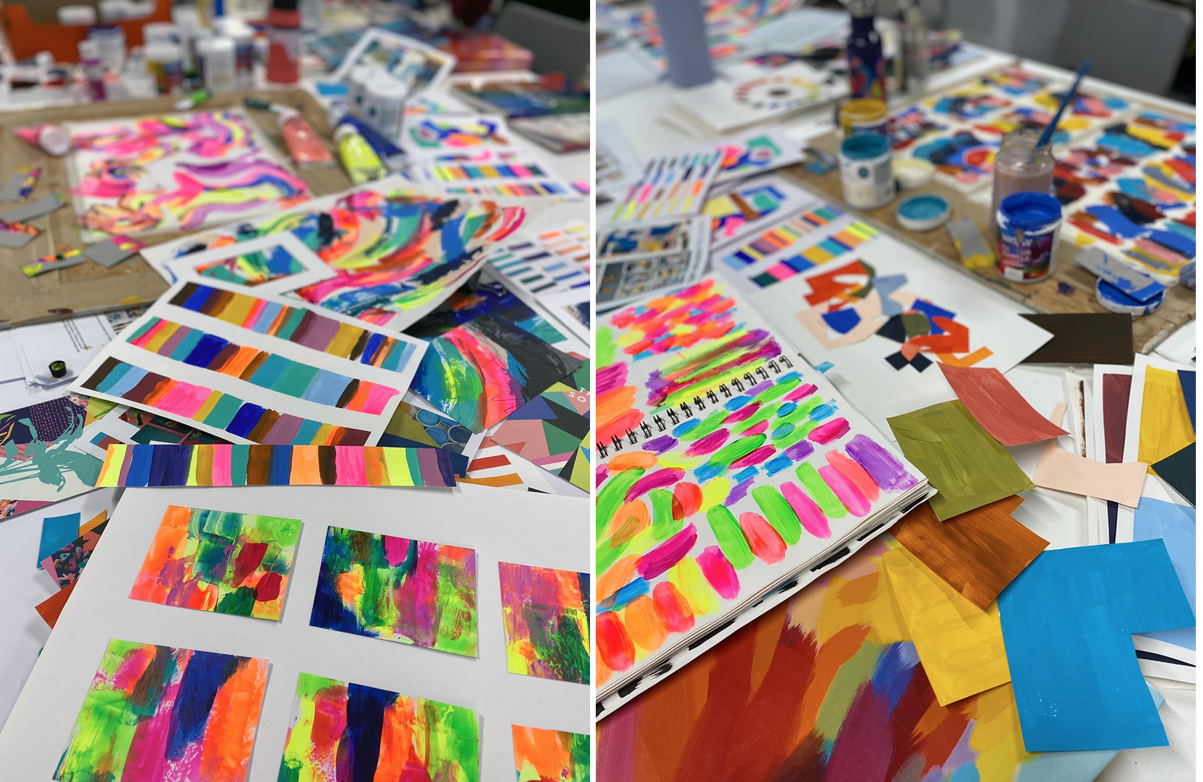
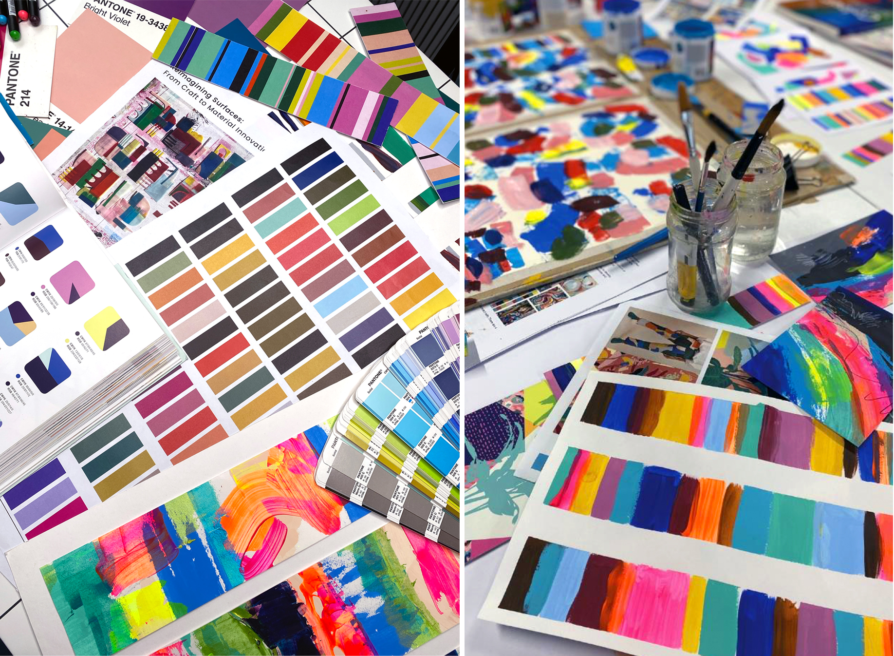
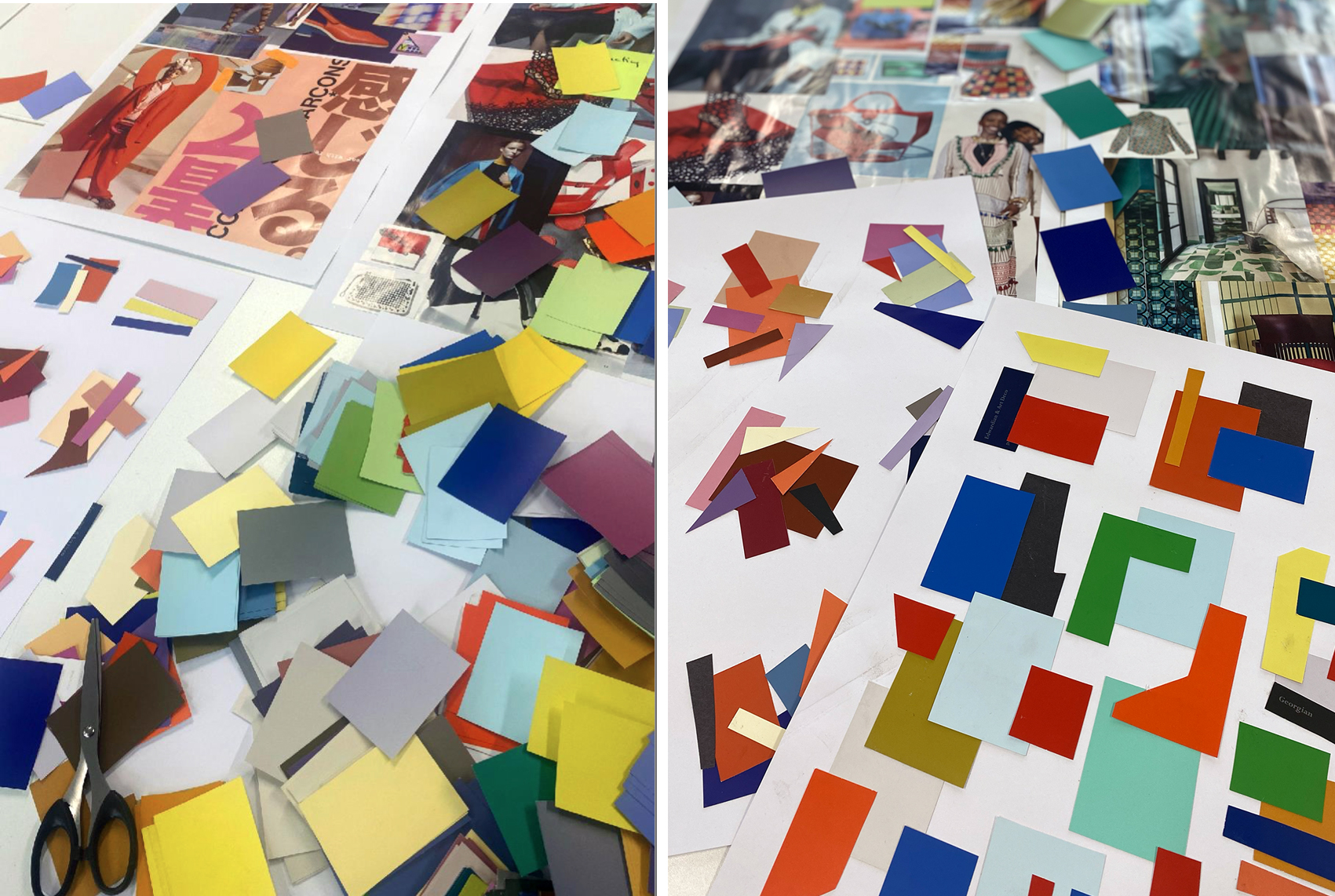
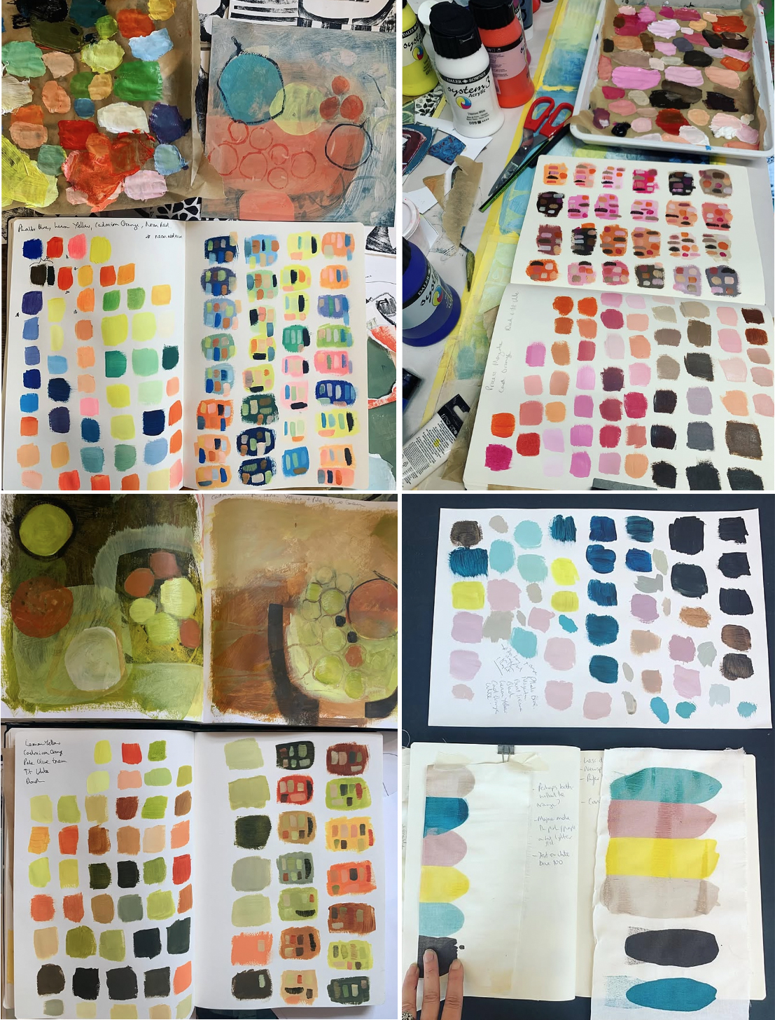
Try mixing colours with paint, creating painted swatches, cutting up coloured papers or collecting scraps of fabric and printed imagery. Arrange them in different combinations, changing their proportions and introducing new colours as you go.
Working physically with colour can reveal relationships that are not always obvious on a screen. It also encourages a more intuitive approach, allowing unexpected combinations and happy accidents to become part of your creative process.
You might begin with a photograph of a building, extract a handful of colours and paint them as flat swatches. Cut the swatches into different shapes and sizes, then rearrange them. Introduce a colour that isn't present in the original photograph. Try a muted version of a bright colour or place two contrasting hues beside one another.
As your palette develops, ask yourself whether it supports the original idea. Does it communicate the intended mood? Does it have enough contrast? Are some colours overpowering others? Could an unexpected accent make it more distinctive?
Remember that colour development is rarely a linear process. Your palette may change as your ideas evolve, and that is an important part of designing.
From Experimentation to Pantone
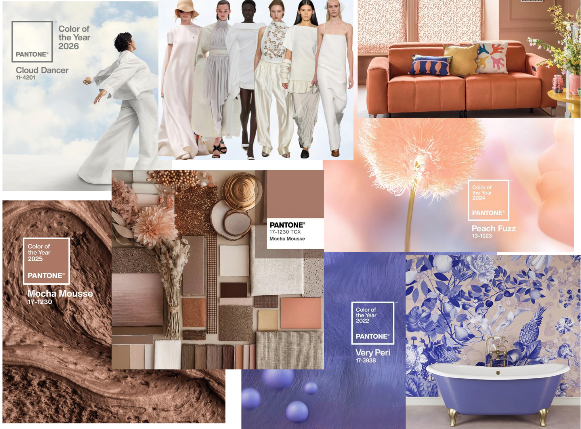
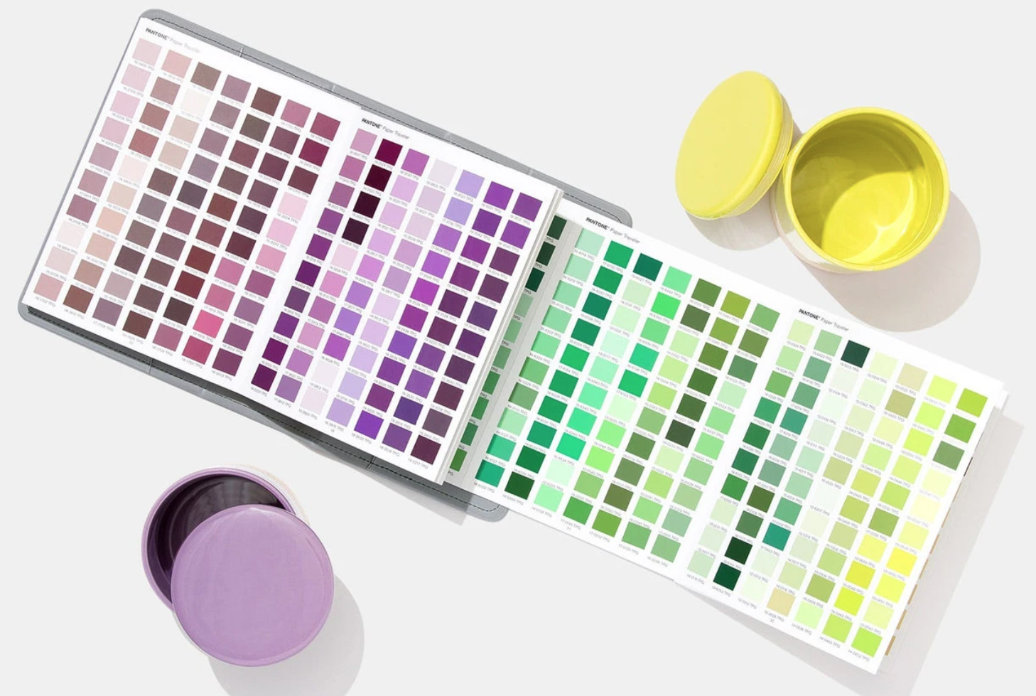
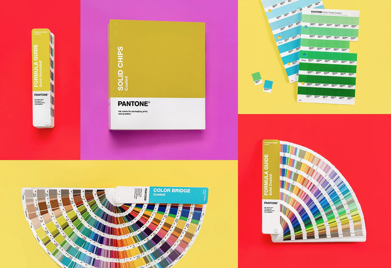 While personal exploration is an essential part of developing a colour palette, professional design also requires us to communicate colour accurately.
This is where Pantone becomes particularly useful.
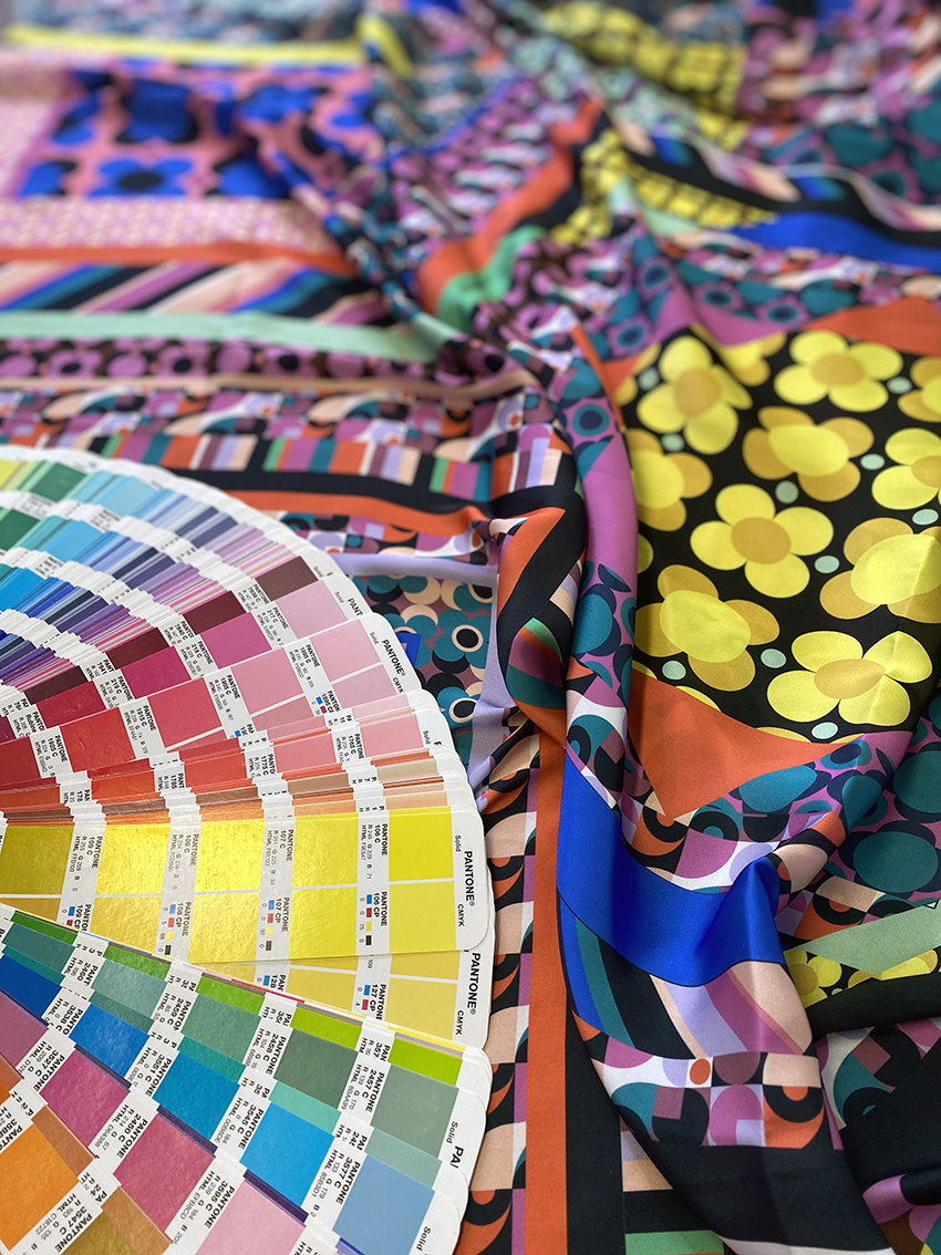
The Pantone Matching System is a standardised colour reference system widely used across the design and print industries. Each colour has a unique reference number, helping designers and manufacturers identify and communicate a specific colour more consistently.
Imagine developing a beautiful palette for a textile collection. You have spent time mixing colours, testing combinations and refining their proportions. When the design moves into production, you may need to communicate those colours to a client, printer or manufacturer. Describing a colour simply as dusty pink, deep teal or warm yellow leaves plenty of room for interpretation.
A Pantone reference provides a more precise starting point for that conversation.
For textile designers, Pantone's textile colour references can be particularly relevant when specifying colours for fabrics and related products. It is important to use the appropriate reference system for the material and production process, as different systems and physical substrates can produce different results.
Pantone does not replace the creative process. It helps translate creative decisions into a shared professional language. Physical samples, material specifications and production checks remain important because the appearance of a colour can vary according to the substrate, finish, lighting and production method.
The key is to understand both sides of colour: the expressive, experimental process of developing a palette and the practical skills needed to communicate it accurately.
Colour Beyond Your Personal Preferences
As designers, we naturally gravitate towards certain colours. We may repeatedly choose particular blues, warm earthy tones, vibrant pinks or muted neutrals because they feel familiar and comfortable.
However, professional design often requires us to work beyond our personal preferences. A client, product, target audience or market may demand a palette that challenges our usual choices.
Being able to explore unfamiliar colour combinations is an important skill. It helps us become more versatile designers and allows us to respond creatively to different briefs and audiences.
Colour can become a recognisable part of a brand's identity, helping products stand out and creating a consistent visual language across a collection. In surface pattern design, the right palette can make a print feel contemporary, nostalgic, playful, sophisticated or bold, even when the underlying motif remains unchanged.
This is why colour deserves to be considered alongside the theme, concept and intended audience from the beginning of a project. It can influence how a design is perceived and how successfully it communicates its intended message.
Learning to work confidently with colour means developing the ability to make intentional choices rather than relying solely on personal taste.
Make Time to Play with Colour
Perhaps the most important part of developing your understanding of colour is giving yourself permission to experiment.
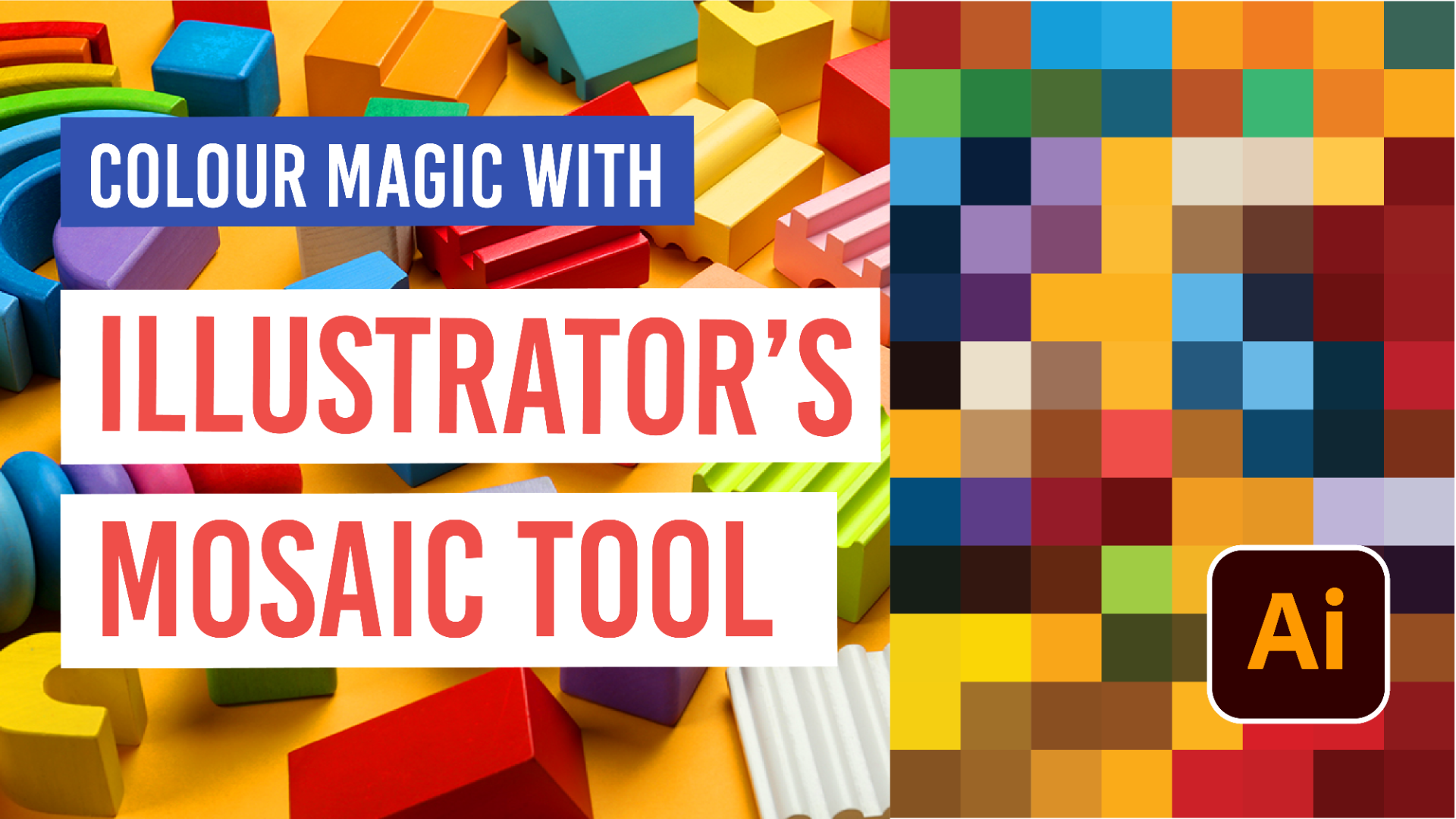
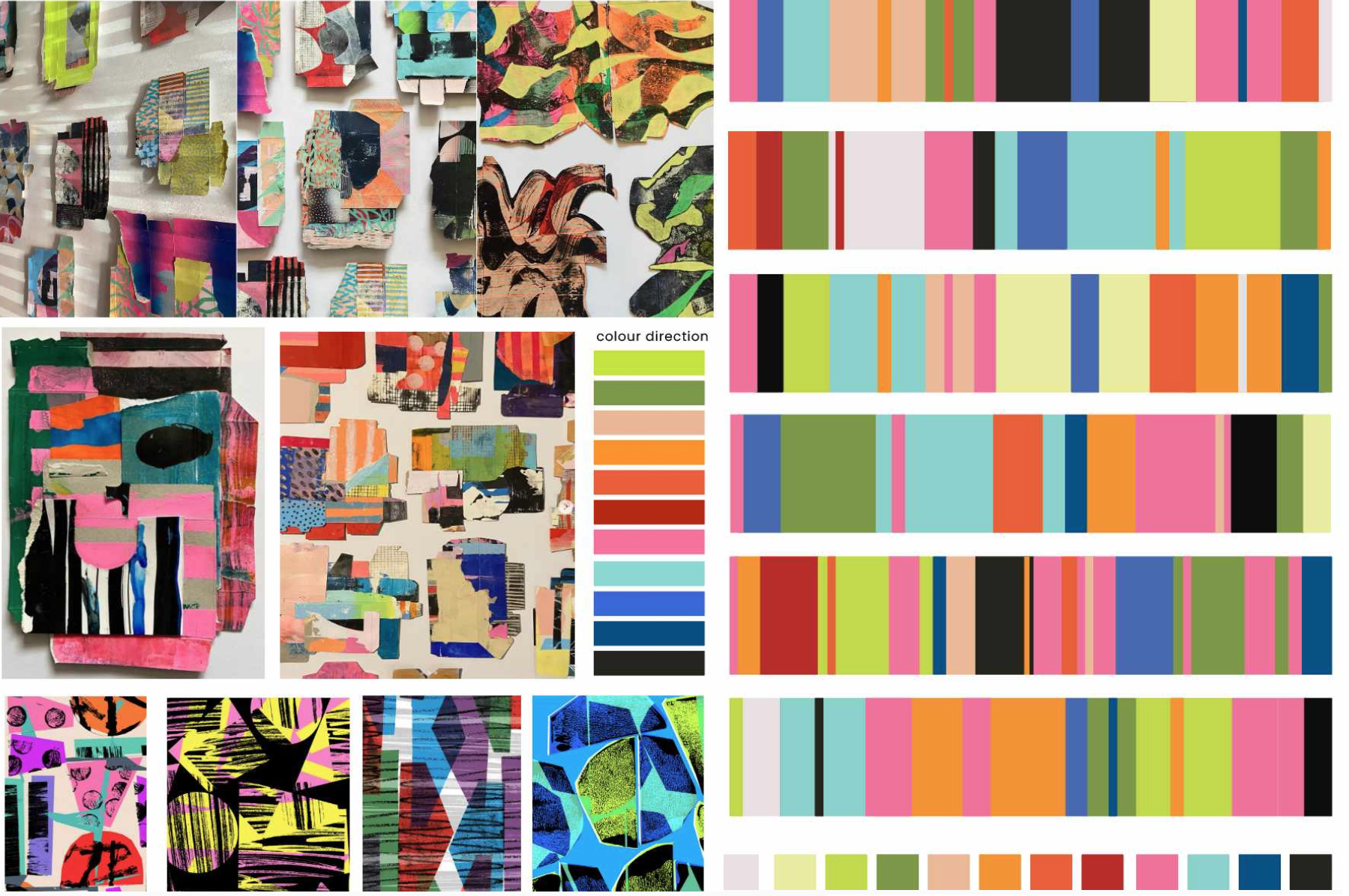
Create palettes that feel unfamiliar. Put colours together that you might normally avoid. Explore the effect of layering, mixing, diluting and changing proportions. Try working with highly saturated colours alongside muted tones, or build a palette around a single colour and discover how many variations you can create. Here Jules demonstrates how you can use artist reference as a starting point for colour development - looking at the amazing painterly collages by textile artist Sarah Bagshaw and selecting colours that work beside each other. This is developed further through digital colour testing to understand colour proportion.
Not every experiment will result in a successful design, but each one can teach you something about how colours behave and how you respond to them.
Josef Albers's Interaction of Color is a wonderful reminder that learning to see colour is an ongoing process. His work encourages us to question what we think we know, look more carefully at the relationships between colours and learn through practical experimentation.
The same approach can be applied to your sketchbook practice. Keep a record of your colour experiments, collect unexpected combinations, revisit earlier palettes and make notes about what works and why. Over time, these observations will help you develop a more personal and confident approach.
Colour theory gives us a foundation, research gives us direction, and experimentation allows us to develop our own approach.
Ultimately, becoming more confident with colour is about learning to look, question, test and take risks. Rather than searching for a perfect palette, focus on discovering the colours, combinations and relationships that make your work distinctive.
So, the next time you begin a design project, don't treat colour as a finishing touch. Give it time, explore its possibilities and allow it to become an essential part of your creative process.
Your own colour language is something you develop through curiosity, observation, experimentation and practice. One person that does this really well is textile designer and educator Fiona Wilson. I simply love how she tests colours. It is super playful and intuitive. She uses it as a exploratory process prior to painting or screen printing to discover a sense of what colours work beside each other.
Further Reading and Inspiration section:
-
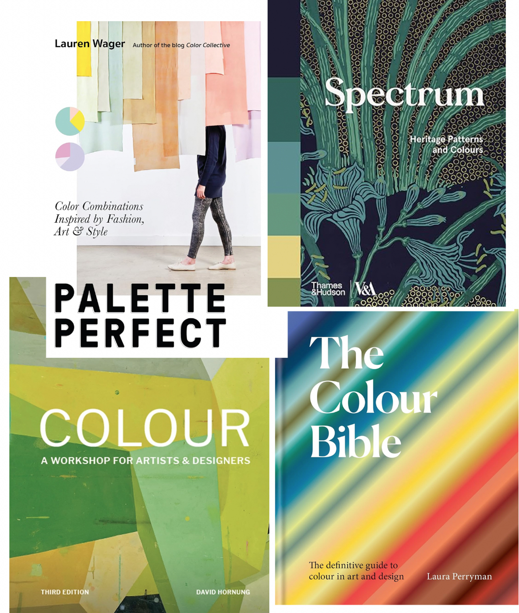
Lauren Wager - Palette Perfect: Color Combinations Inspired by Fashion, Art and Style. Palette Perfect is both a practical guide and an inspirational book that proposes a reflection on the universe of colour combinations, the moods and atmospheres they evoke and how we associate particular places and emotions with special colours.
-
Ros Byam Shaw - Spectrum: Heritage Patterns and Colour. A useful reference for exploring colour palettes and the relationship between colour and pattern.
-
David Hornung - Color: A Workshop for Artists and Designers. A practical resource for developing colour theory through experimentation.
-
Laura Perryman - The Colour Bible: The definitive guide to colour in art and design. An essential source for graphic designers, artists, interior designers, fashion designers, illustrators and creatives of any kind who work with colour.
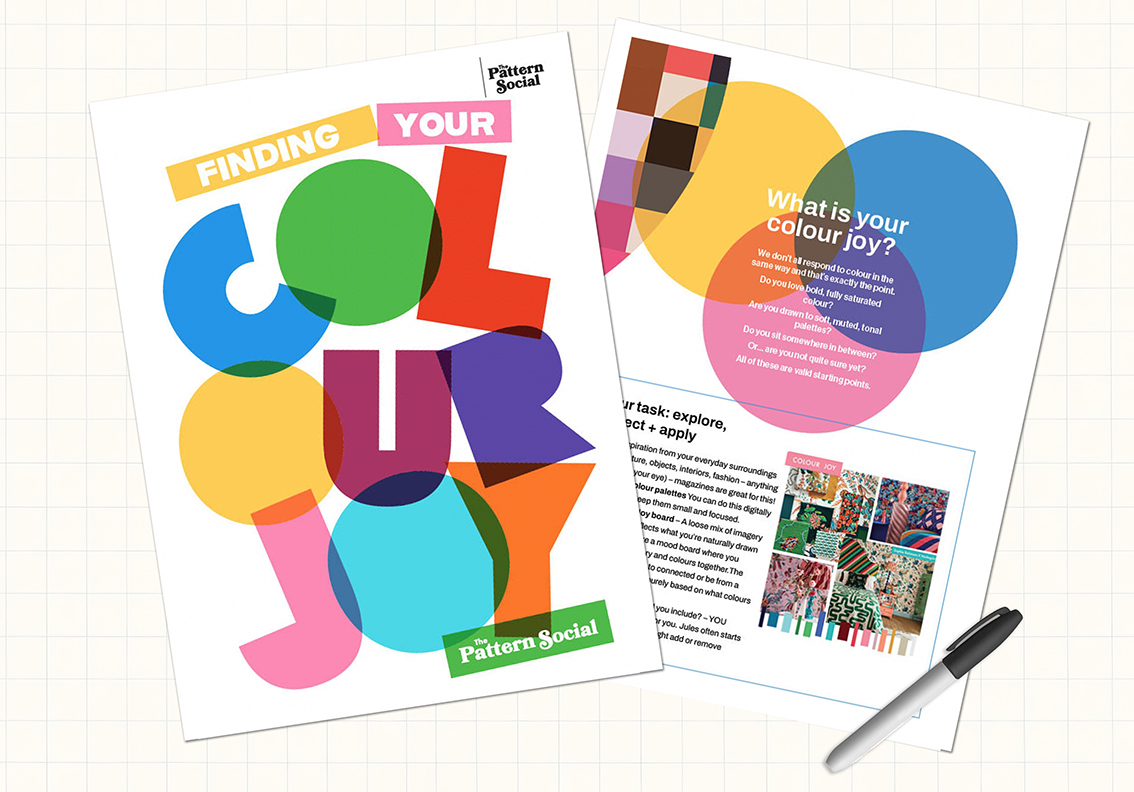
Want to tap into one of Jules' colour workshops? Join the mini Colour course - Finding your Colour Joy. Click here to JOIN FOR FREE